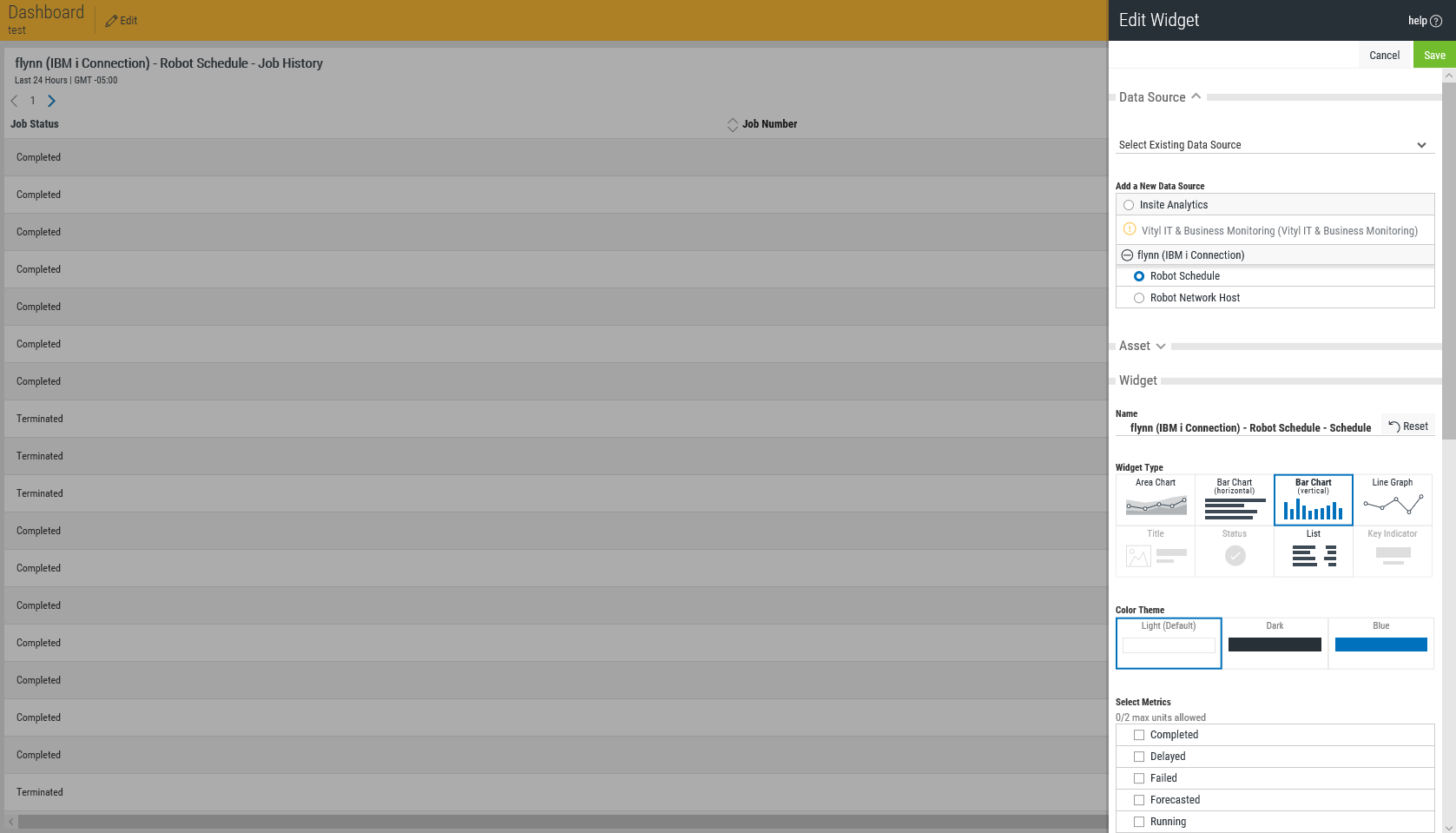
Add/Edit Widget pane
How to Get There
Click  (Dashboards) in the Navigation Pane to open the Dashboard screen, which displays the list of available Dashboards. Click a Dashboard. Or, click Add A Dashboard to create a new one, define the Dashboard, and click Save. Within the Dashboard pane, click Add Widget or Edit Widget.
What it Does
Use this pane to define the Widget you would like to add to the Dashboard.
Widgets are visual representations of data extracted from an Insite Product Connection.
Widgets are added to a dashboard layout, which can be customized to provide a unique, at-a-glance, real-time view of your business.
The options available here depend on the type of data selected.
To learn about adding or editing widgets, see Working with Widgets.
Options
Data Source
Select Existing Data Source • Add a New Data Source
Use the Select Existing Data Source drop-down list to select an existing Data Source/Widget to modify. Data Source refers to Product Connections added to Insite.
Use the Add a New Data Source list to identify the Product Connection and Product whose data you would like to display on the Dashboard. Saved Widgets appear in this list, identified by the Data Source, Product, and Asset of the Widget, for this Dashboard.
Systems configured as Product Connections in Insite appear in the Add a New Data Source list. See Adding a New Product Connection in the Inside help for more details.
See Data Sources.
Asset
Assets are the business services, processes, and applications that have been configured, for which you can generate a visual representation within Insite via a widget.
Once a Data Source has been selected, you can then select the asset that the widget will represent. Only the assets from the selected Data Source are available. If the required asset is not displayed, it must first be created in the Data Source before it is available within Insite.
Assets are initially displayed at their highest level of configuration. Click  Expand to drill-down into the asset. The drill-down process is available for every asset level against which the Expand icon is displayed.
See Assets.
Searching For Assets
If the Data Source for which you are creating the widget contains a large number of assets, it may be quicker to use the Search facility to find a starting point, rather than expanding multiple asset entries to locate the one that you require.
In the Search assets field at the top of the Assets section, type the name of the asset you want to locate and press Enter. The text is not case-sensitive. Any Assets that match the entered text are now displayed and can be selected or expanded as required.
Widgets
Widget
Use these settings to select the format of the visual display and the specific metrics to be shown. The available Widget display types depend on the Asset chosen.
Name • Reset
This field displays the Product Connection, Product, and Asset being edited. Click Reset to restore default settings for the Widget.
Widget Type
Choose the format of the visual representation from these icons. Not all Widget Types are available for every asset.
Color Theme
These three display options are available for the Chart Widget type.
Select Metrics
From this list, select the metrics you would like to display. The metrics available depend on the Asset and Widget type chosen.
Widget Advanced Settings
Some Data Sources will give you the option of specifying advanced settings for your widget. The advanced settings available for each widget will depend on the type of widget selected. See below for advanced settings definitions by widget type:
 Key Indicator:
Auto-Refresh
You can change the default refresh rate by turning this setting to Custom and enter the number of minutes to wait until the next refresh, or keep this setting at Inherit to have your widget's refresh rate be the same as the parent dashboard.
Header
You can use this setting to hide or show the widget header. The default is to show.
Title
You can use this setting to hide or show the widget Title. The default is to show.
Indicator
Use this setting to change the value of the indicator shown. The default is 'Last value in the period'.
Chart:
Auto-Refresh
You can change the default refresh rate by turning this setting to Custom and enter the number of minutes to wait until the next refresh, or keep this setting at Inherit to have your widget's refresh rate be the same as the parent dashboard.
Non-Value Axis
Use this setting to change the value displaying in the Non-Value Axis.
Layout
You can change the type of chart displaying your widget data. The default is to Line. Other possible values are: Bar, Area, and Column.
Header
You can use this setting to hide or show the widget header. The default is to show.
Title
You can use this setting to hide or show the widget title. The default is to show.
Legends
You can use this setting to hide or show the widget legends. The default is to show.
Grid Lines
You can use this setting to hide or show the widget grid lines. The default is to show.
Thresholds
You can use this setting to hide or show the widget thresholds. The default is to show.
Axis Labels
You can use this setting to hide or show the widget axis labels. The default is to show.
Axis Label
Use this setting to change the chart axis label. Change setting to Custom and enter a new label to change.
Axis Unit Label
Use this setting to change the chart axis unit label. Change setting to Custom and enter a new label to change.
Axis Range
Use this setting to change the chart axis range. Change setting to Custom and enter a new range to change.
List:
Auto-Refresh
You can change the default refresh rate by turning this setting to Custom and enter the number of minutes to wait until the next refresh, or keep this setting at Inherit to have your widget's refresh rate be the same as the parent dashboard.
Grouping field
Use this setting to change the field that the data is grouped by from the dropdown list of available fields.
Header
You can use this setting to hide or show the widget header. The default is to show.
Title
You can use this setting to hide or show the widget Title. The default is to show.
Column Order and Default Sorting
Use this setting to change the order in which the selected fields are displayed in the widget and the desired sort order within each field (Ascending or Descending). You can also delete out selected fields from the display.
Status:
Auto-Refresh
You can change the default refresh rate by turning this setting to Custom and enter the number of minutes to wait until the next refresh, or keep this setting at Inherit to have your widget's refresh rate be the same as the parent dashboard.
Header
You can use this setting to hide or show the widget header. The default is to show.
Title
You can use this setting to hide or show the widget Title. The default is to show.
Title:
Title
Enter the title of your widget in this field.
Subtitle
Enter the subtitle of your widget in this field.
Text Align
You can use this setting to display your widget text as left-aligned, right-aligned, or centered.
Background Options
You can use this setting to upload an image as your widget background or select a solid color background.